Background
Aetna’s “Aetna One Advocate” program needed an email campaign to encourage A1C testing and educate diabetes patients on using in-network facilities, delivering critical health information without adding to their stress.
Aetna’s “Aetna One Advocate” program required a targeted email campaign to support members managing diabetes. The primary objective was to encourage routine A1C testing and educate patients on the convenience of using independent, in-network facilities like Quest Diagnostics® and Labcorp®. The business needed an effective way to deliver this critical health maintenance information directly to members’ inboxes without causing additional stress or fatigue.
Challenge
Because patient burnout is a real obstacle in diabetes management, the design needed to feel warm and empathetic rather than clinical, while translating complex healthcare guidance into an accessible format that met Aetna’s strict brand and accessibility standards.
Communication surrounding chronic conditions often risks feeling cold, overwhelming, or overly clinical. Because patient burnout is a very real obstacle in diabetes management, the core challenge was to present testing information in a highly empathetic, supportive manner. The design needed to translate complex healthcare guidance into an engaging, non-intimidating format while adhering strictly to Aetna’s corporate brand standards and strict accessibility requirements.
Solution
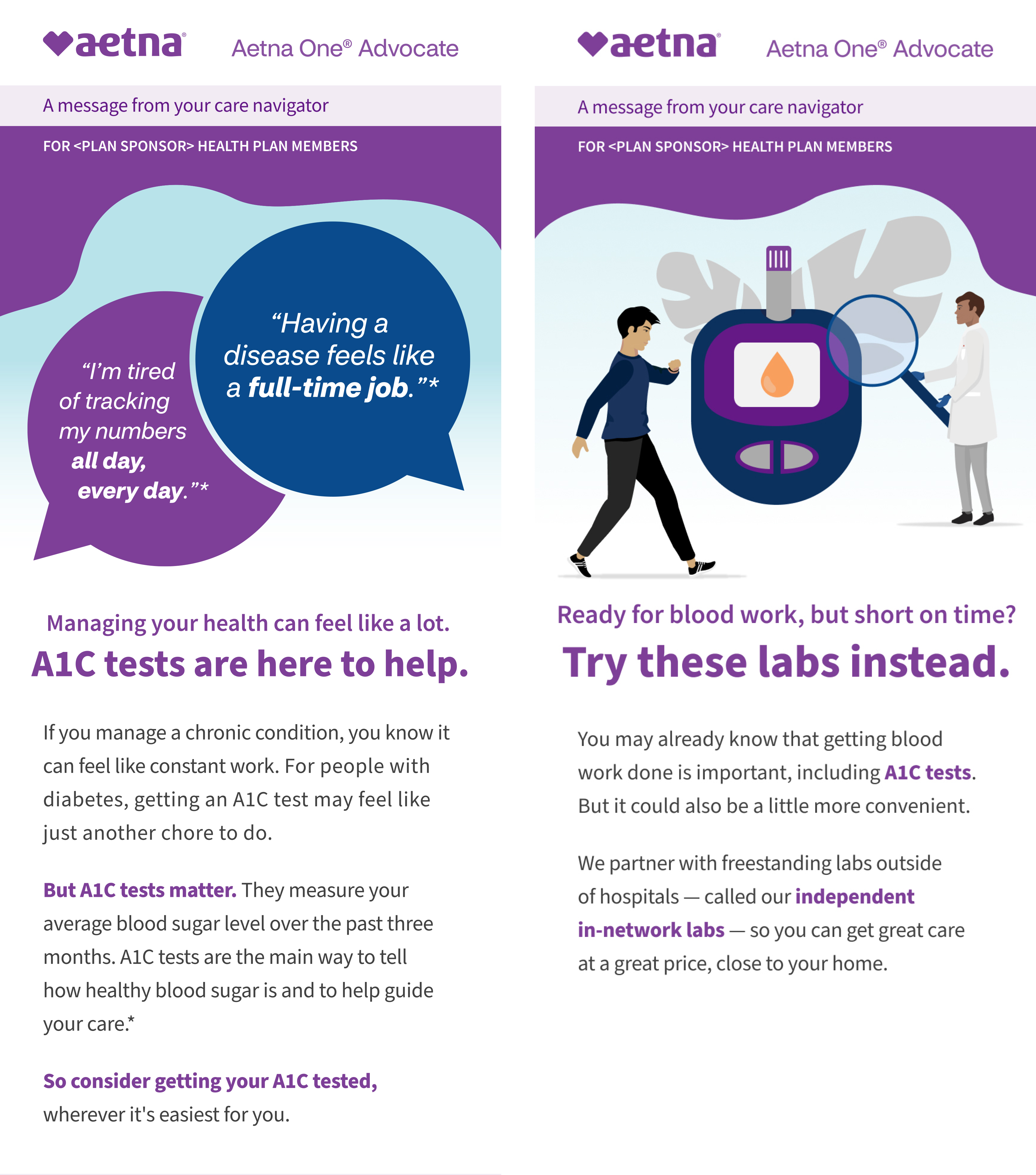
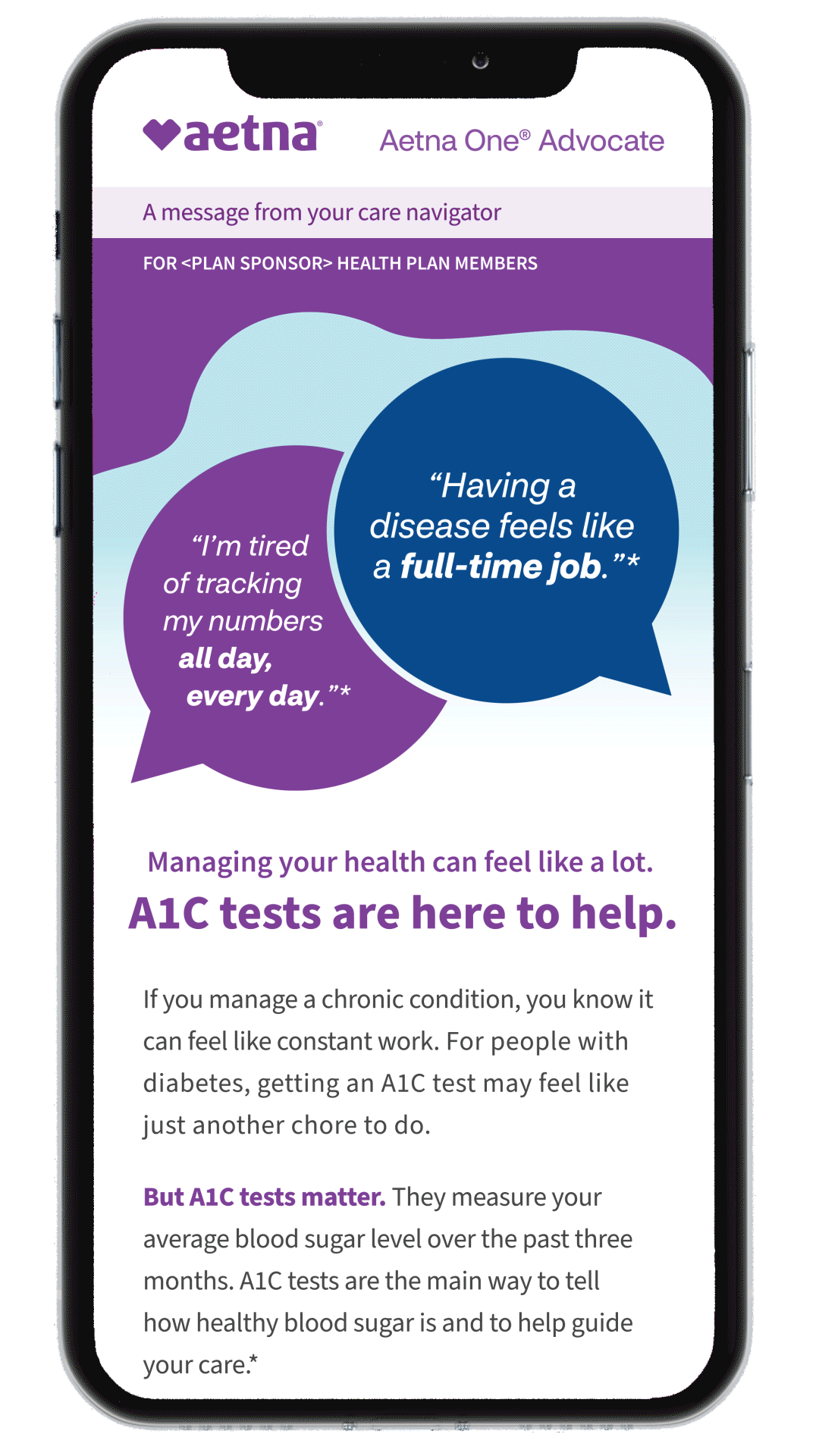
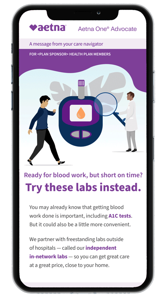
A clean, modular layout breaks complex guidance into digestible sections. Custom flat illustrations humanize the messaging by highlighting relatable patient moments and collaborative care, guiding users naturally through the content to the call-to-action without visual clutter.
To ensure high readability and professionalism, I developed a clean, breathable layout that breaks the copy into easily digestible, modular sections. I incorporated custom flat illustrations that instantly humanize the messaging, highlighting relatable patient frustrations and collaborative care, to make the content feel approachable. By establishing a cohesive “family” style and consistent visual hierarchy across the entire series, the campaign successfully guided users through the educational information and directly to the call-to-action buttons without visual clutter.